SIT_&_SIP_MAGAZINE_

:OBJECTIVE
The assignment was to design a conceptual culture magazine, building a cohesive visual system that uses typography, layout, and pacing to express an idea with clarity and feeling. Alongside the print piece, I created a 30-second motion graphic to support and publicize the magazine’s release in public spaces.
Concept Statement
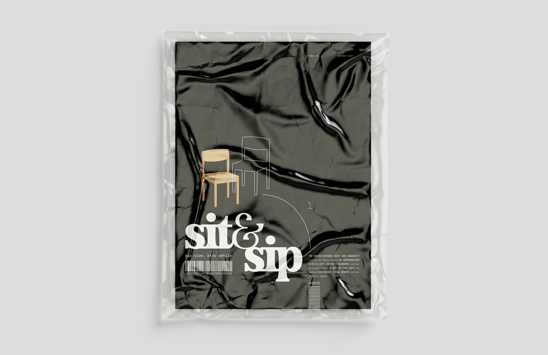
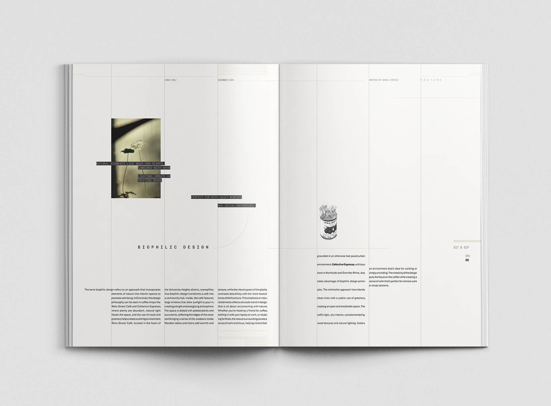
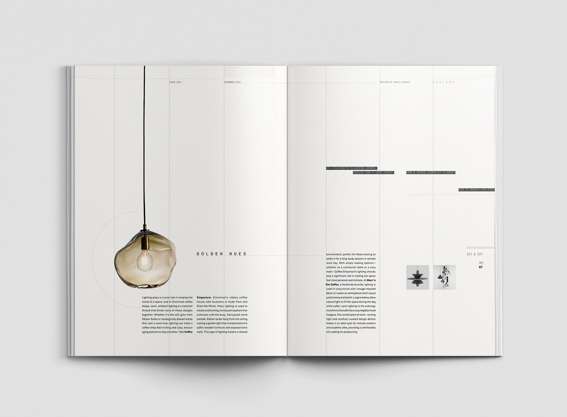
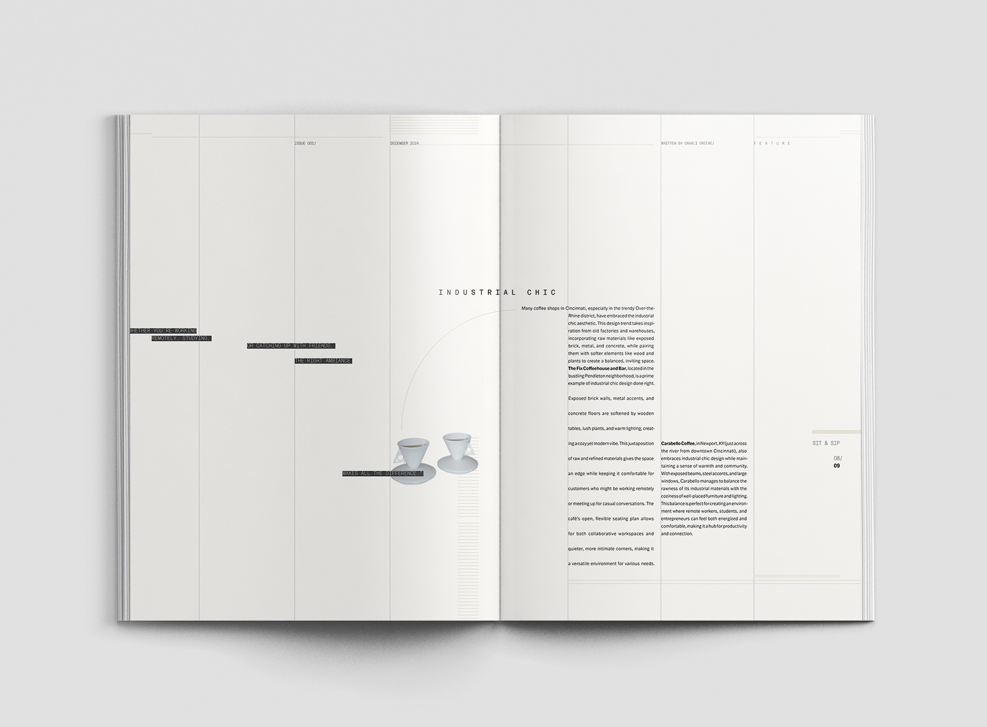
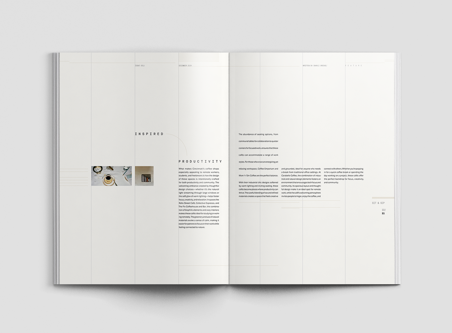
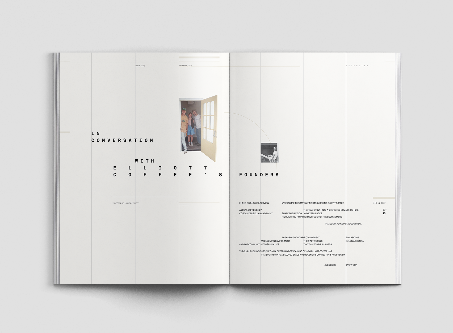
Sit and Sip, a cultural magazine, is a visual ode to the warmth, community, and quiet creativity of coffee shops in Cincinnati, Ohio.
:VISUAL SYSTEM
A visual system was developed to maintain consistency throughout the magazine and in future volumes.
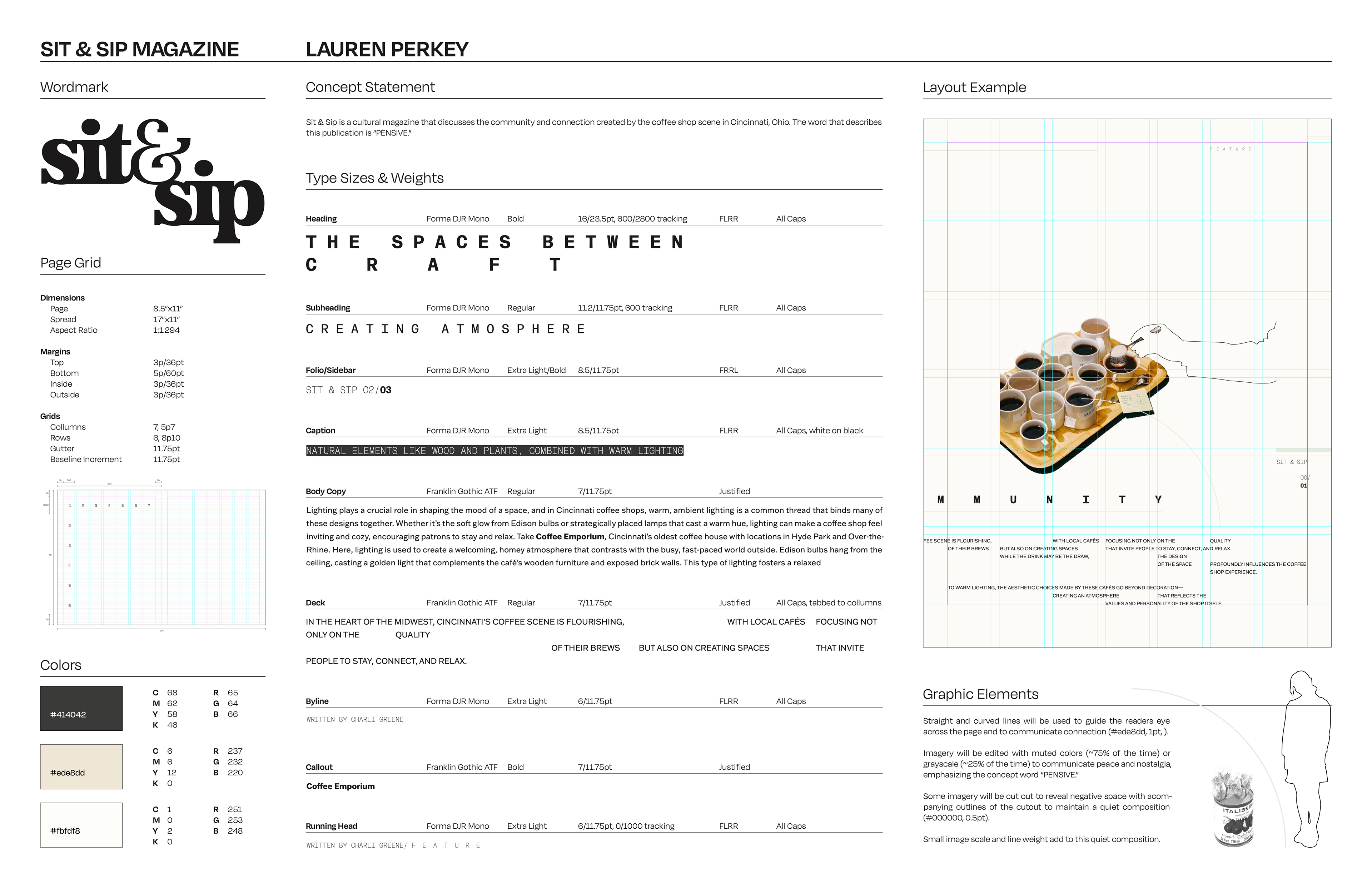
:WORDMARK


I began experimenting with different typefaces and ways of merging the words “sit & sip” to reflect the magazine’s concept statement, aiming for something that felt connected, inviting, and creative through

:ITERATIONS
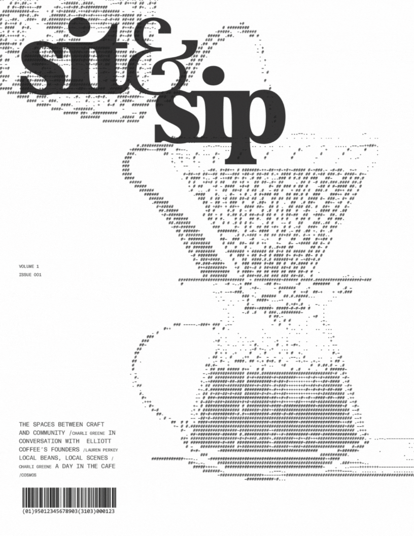
For the front cover, I explored artistic interpretations of the magazine’s name, Sit & Sip, while iterating on various layouts using type and branded elements.
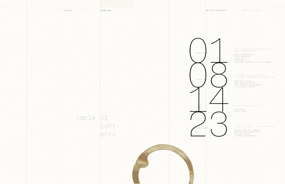
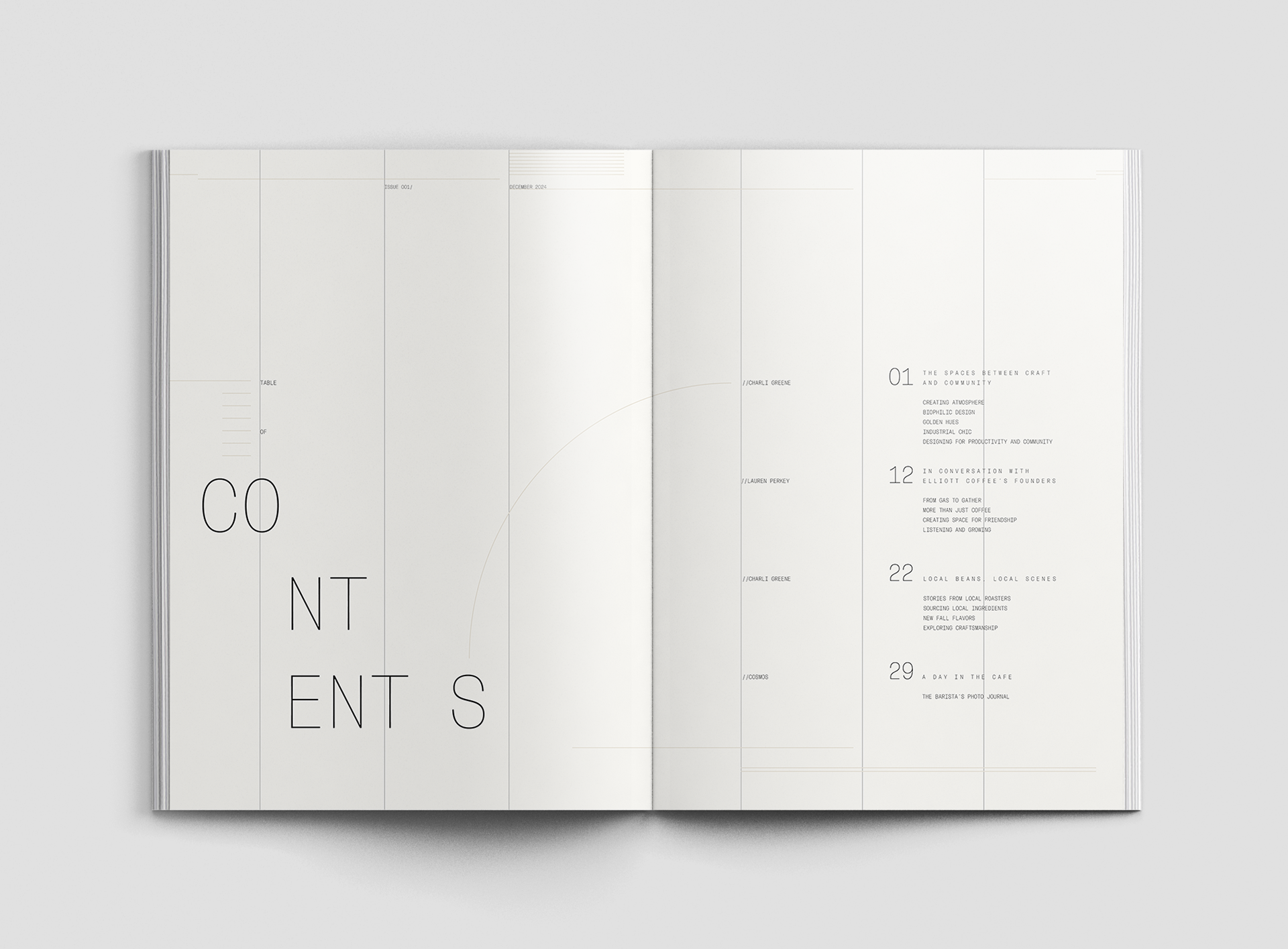
For the table of contents, I focused on legibility and guiding the eye naturally across the page, experimenting with type hierarchy and spatial balance.
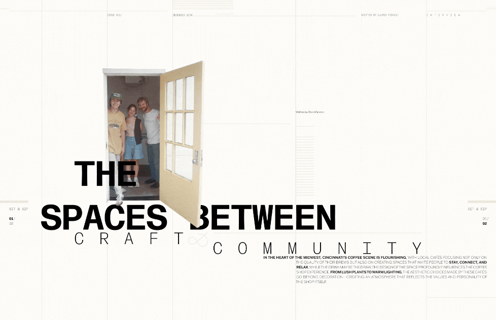
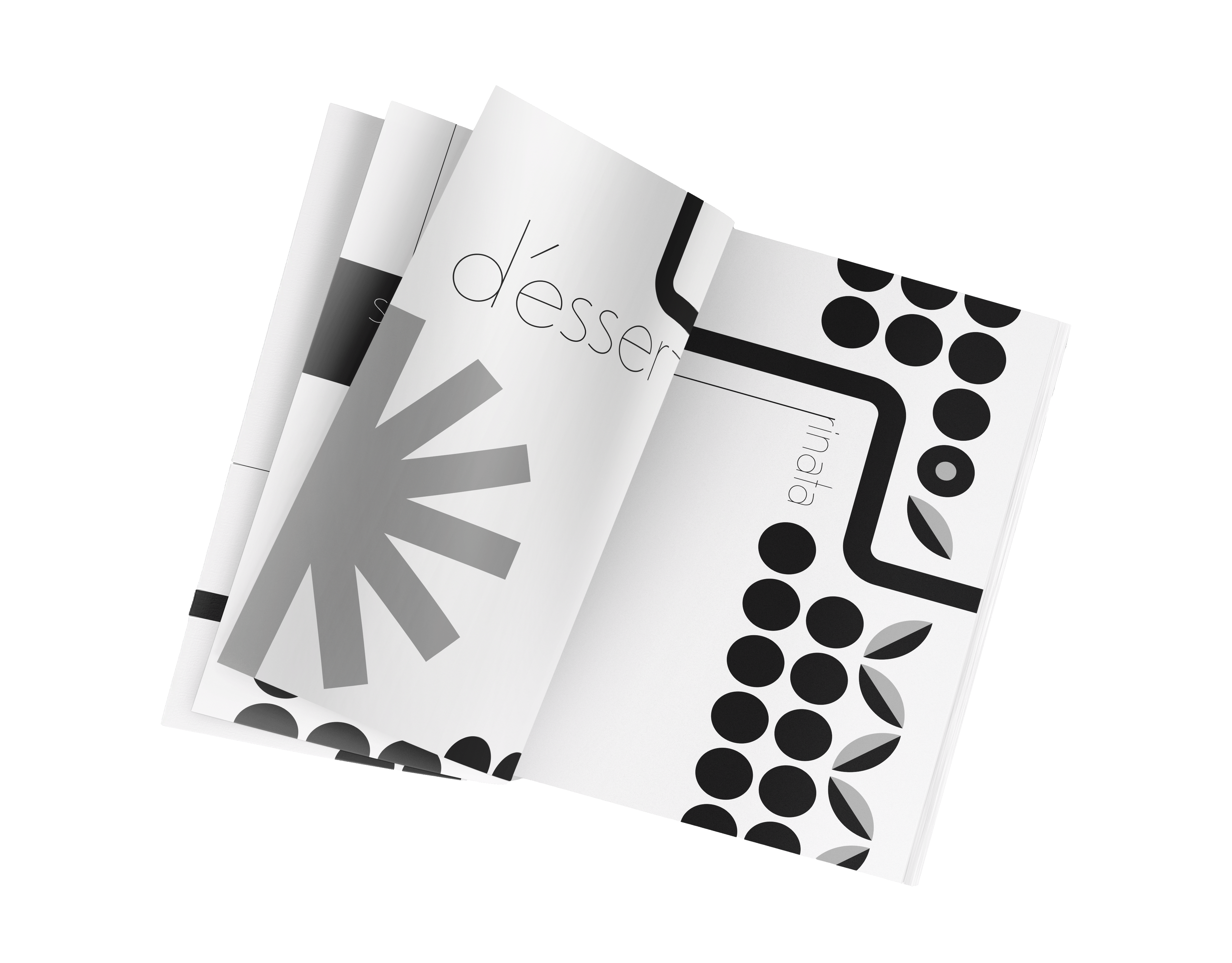
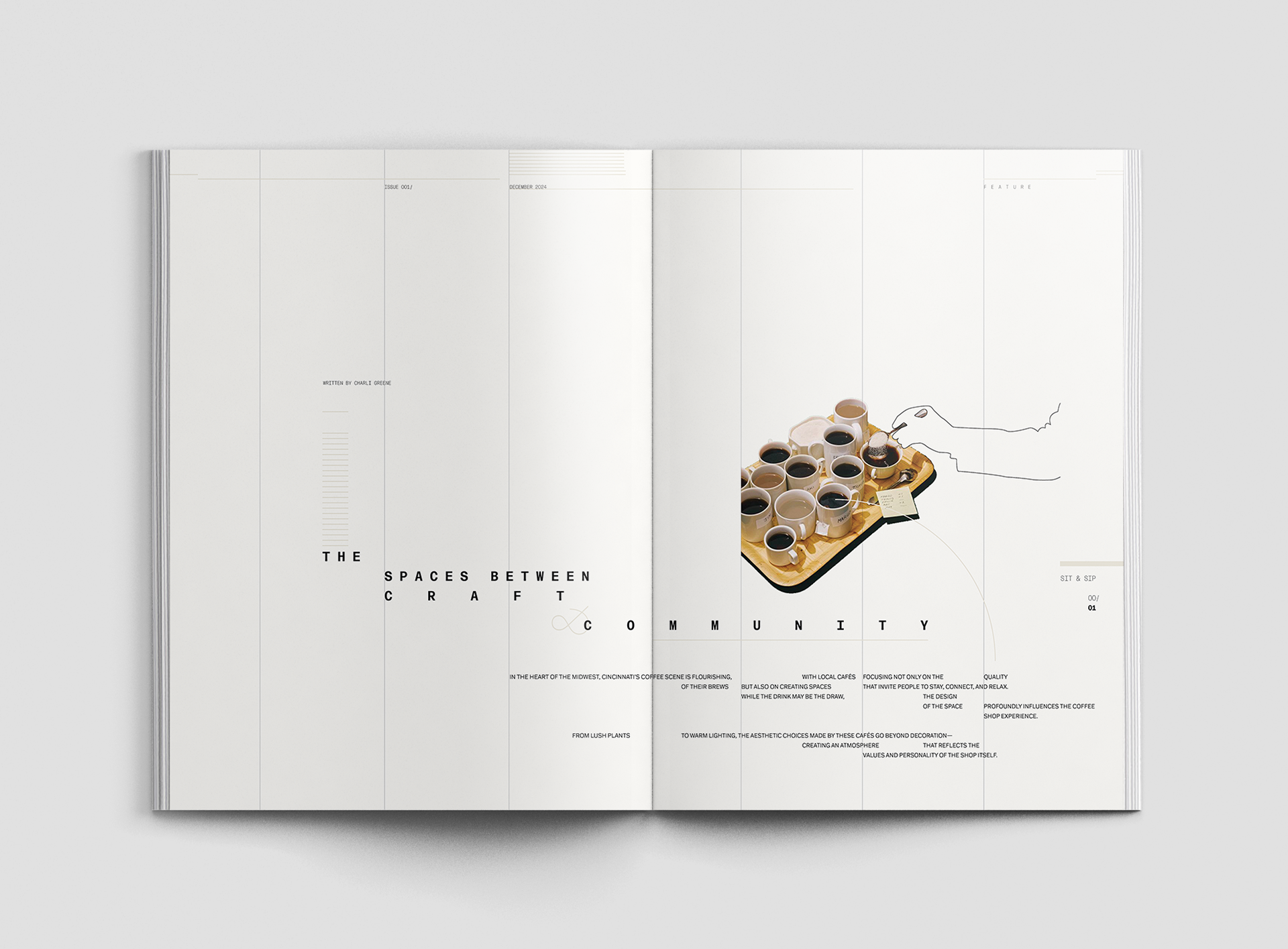
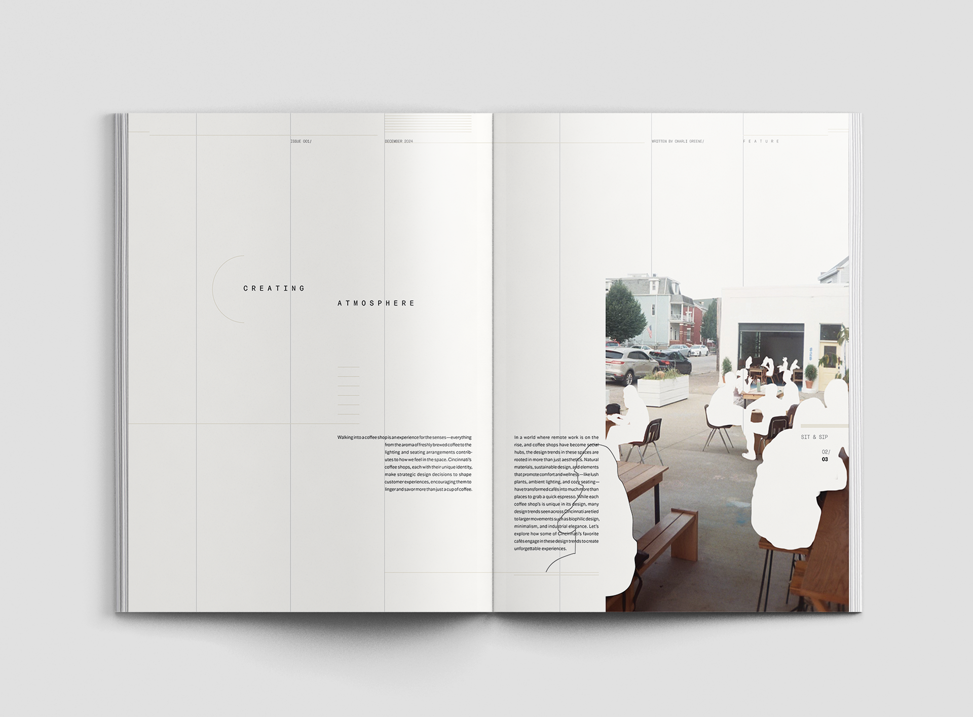
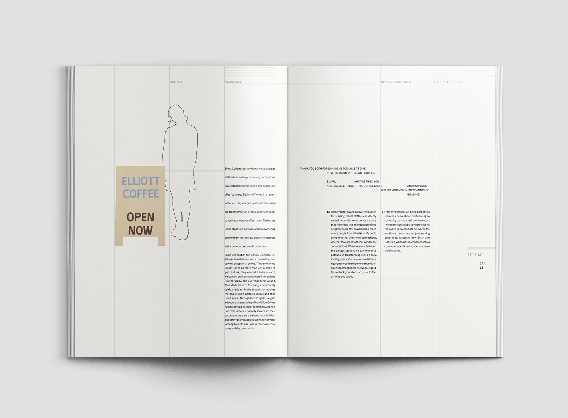
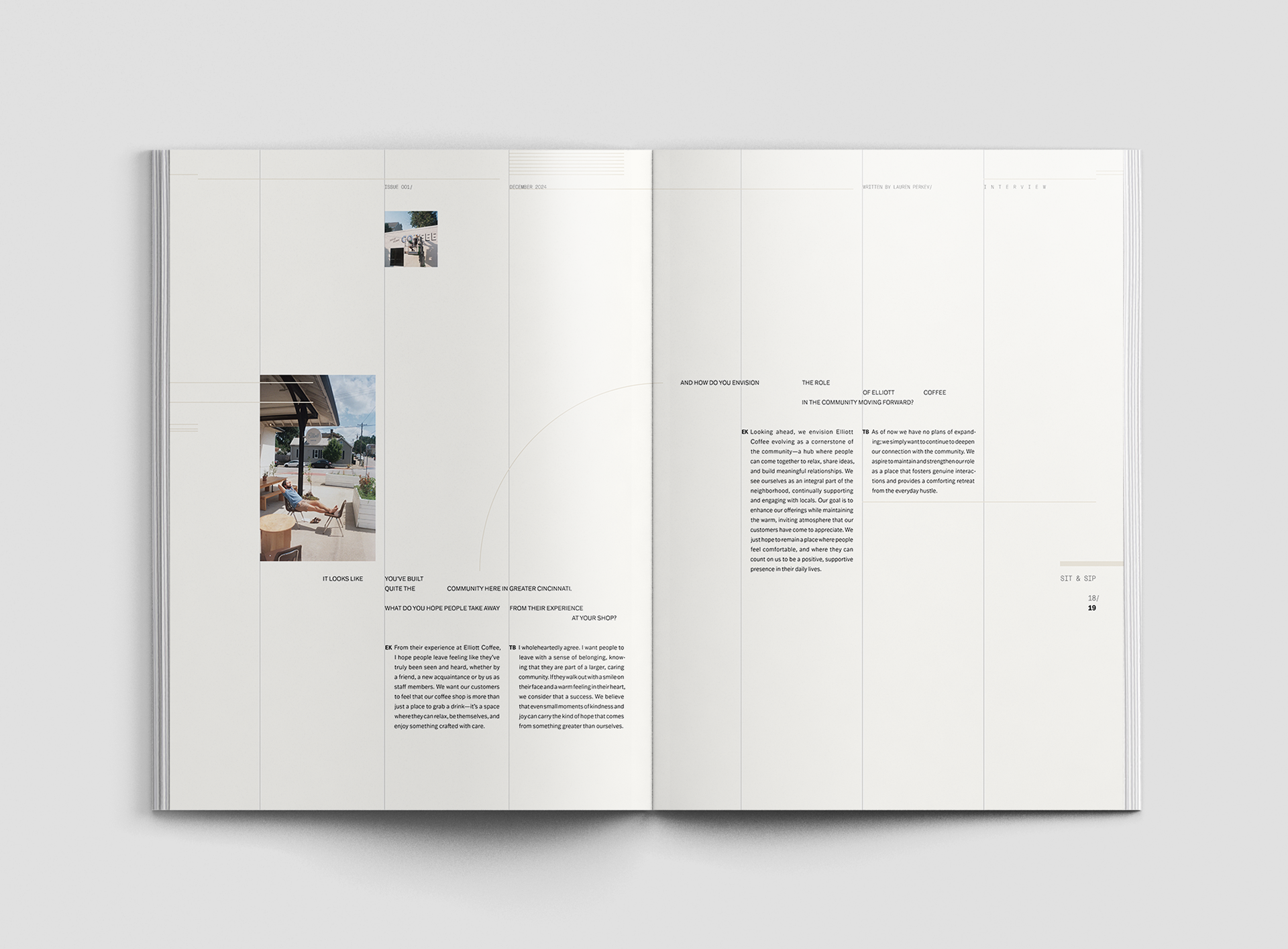
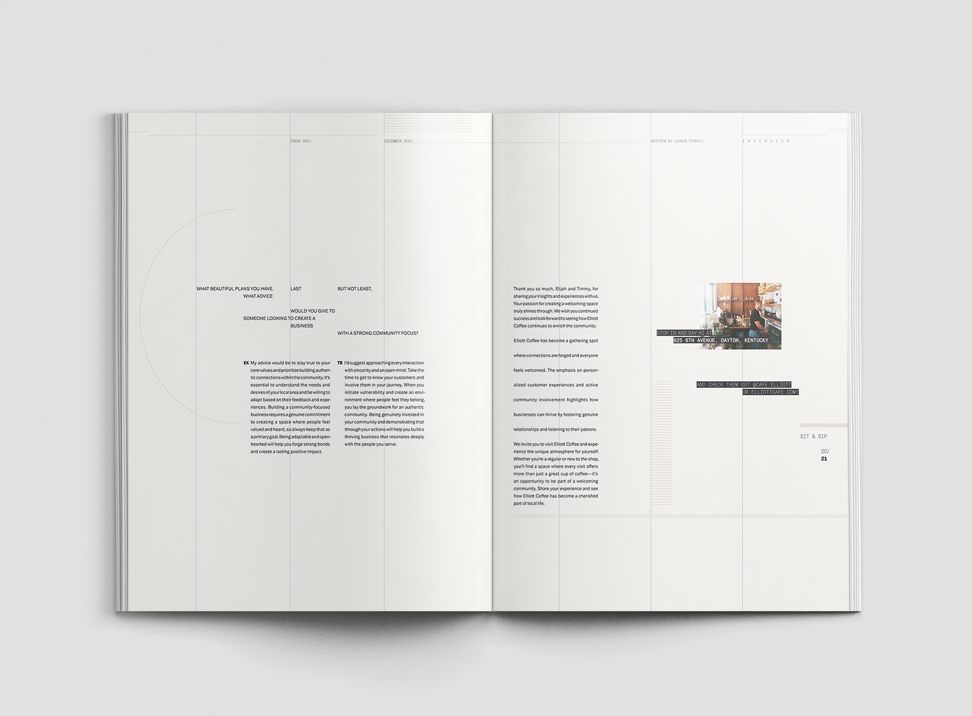
Across the magazine spreads, I explored ways to evoke a quiet, reflective tone through intentional white space while maintaining visual and branding consistency to ensure a cohesive reading experience.
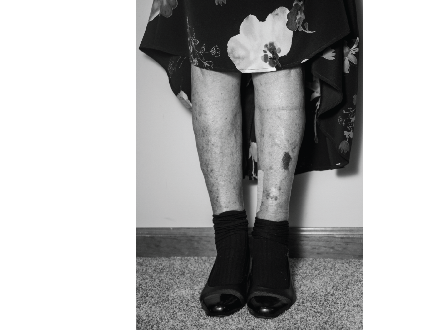
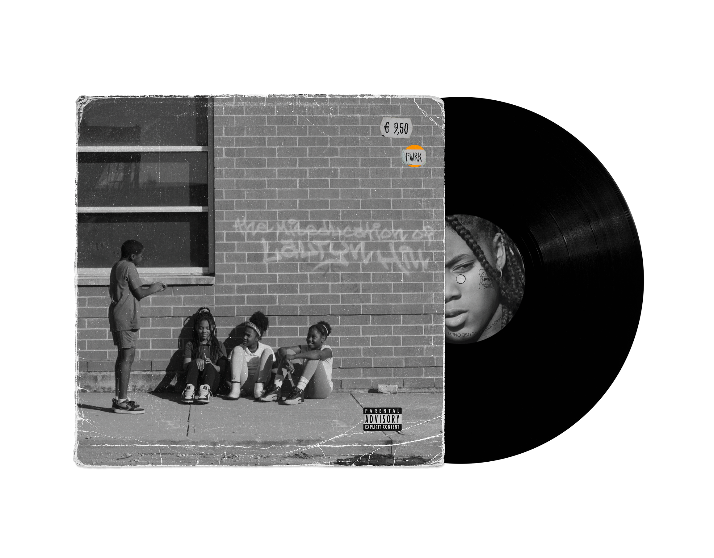
:FINAL COVER
:FINAL SPREADS

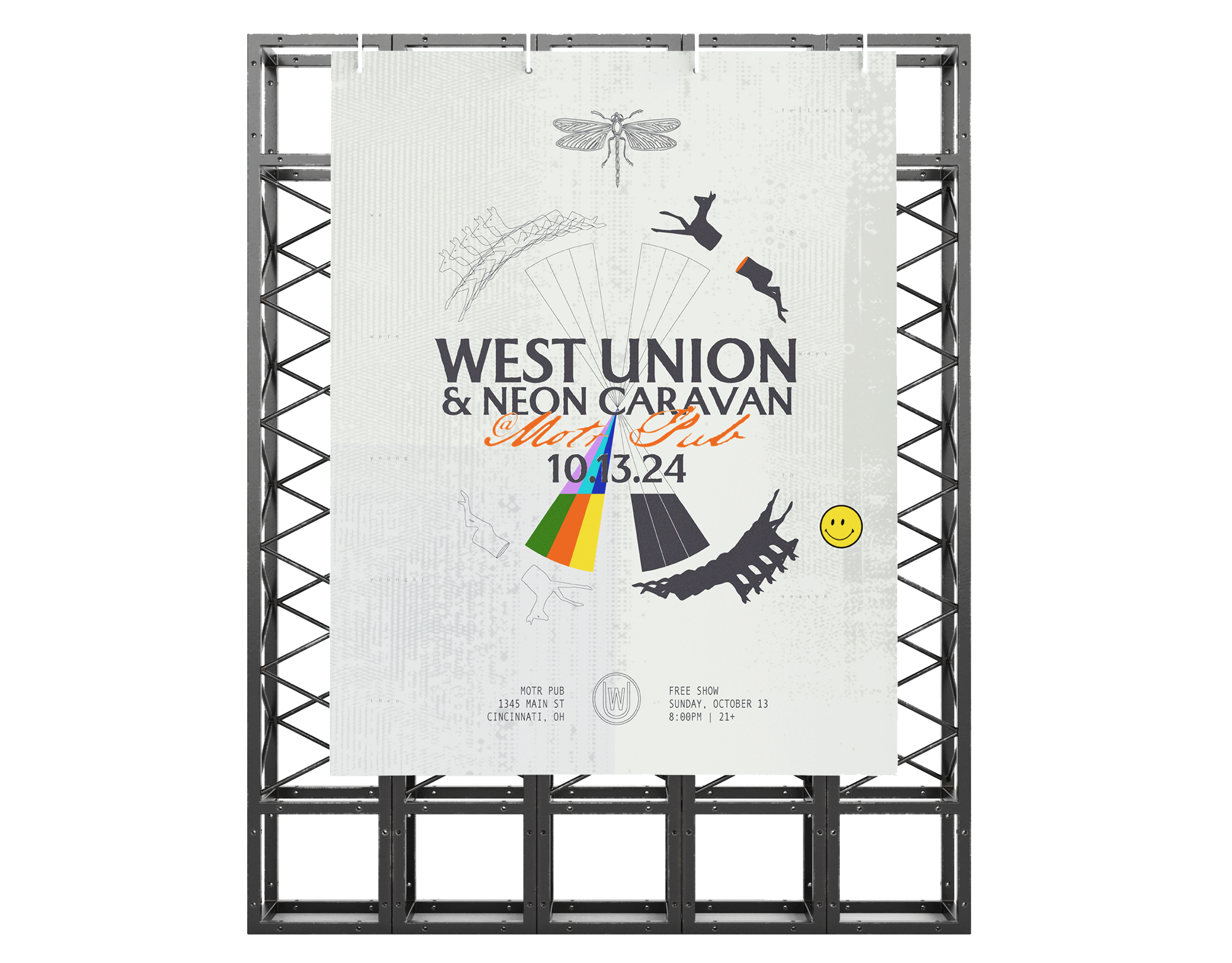
:PROMOTIONAL BROADCAST VIDEO
This motion piece was created to publicize Sit & Sip in public spaces such as digital billboards or subway screens. Rather than selling its features, the piece draws viewers in through the magazine’s soft, welcoming tone, inviting them to pause, feel, and take interest.