CIDERPALOOZA_POSTER_
:OBJECTIVE
The poster for the indie band’s upcoming show at Ciderpalooza showcases the band’s identity while highlighting key details like the date, time, and location. It blends the band’s voice with engaging design, ensuring the information is both compelling and easy to read.
:PERSONALITY
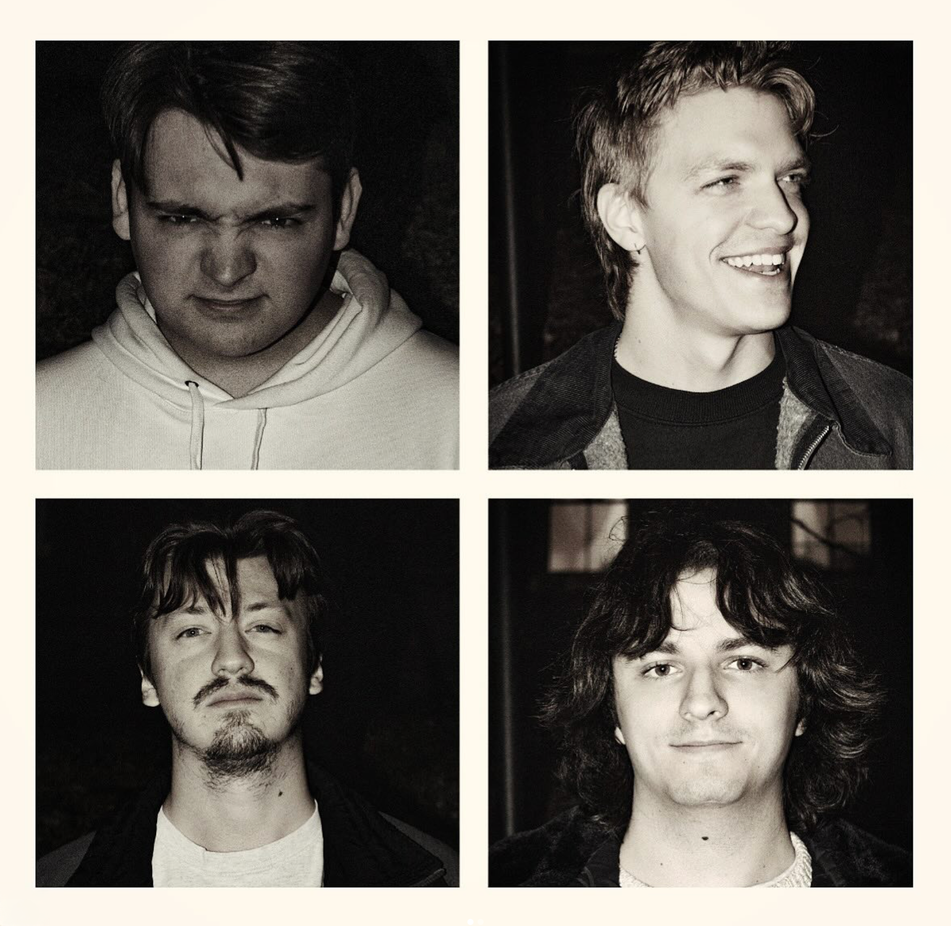
West Union, previously Buzzard Roost, formed in August 2019 by Eric, Sam, Josh, and Liam, and was rooted in collaboration and friendship. Their debut album, "On the Run," captures the band’s heartfelt personality, exploring themes of longing and escape.
Explore WEST UNION
:CORPORATE ASSETS


:RESEARCH


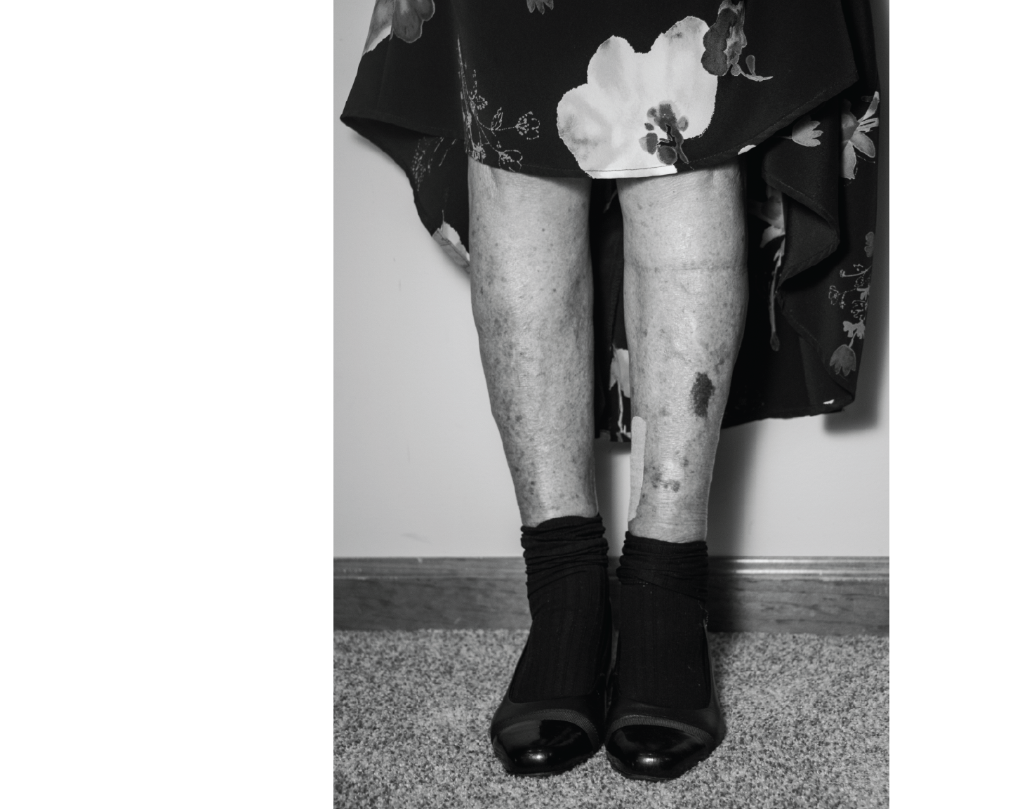
The band was inspired by the work of Eric Timothy Carlson (shown above), the artist behind Bon Iver's album art, and wanted their poster to capture similar themes and visuals.
:COLOR/TYPOGRAPHY/TEXTURE


The color scheme was shaped by the band's alternative musical expression. Vibrant colors were used sparingly to surprise their audience, with the dominant colors remaining neutral to emphasize their rugged, nostalgic tone.

I experimented with monospaced and statement display typefaces to capture the band's alternative and gritty expression. The fonts provided by the band were also tested and refined to complement their distinctive aesthetic.


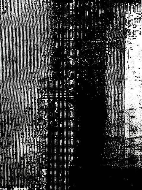
Textures were utilized to soften the clean lines established by the vectors and to blend the design elements.
:DIGITAL ITERATIONS
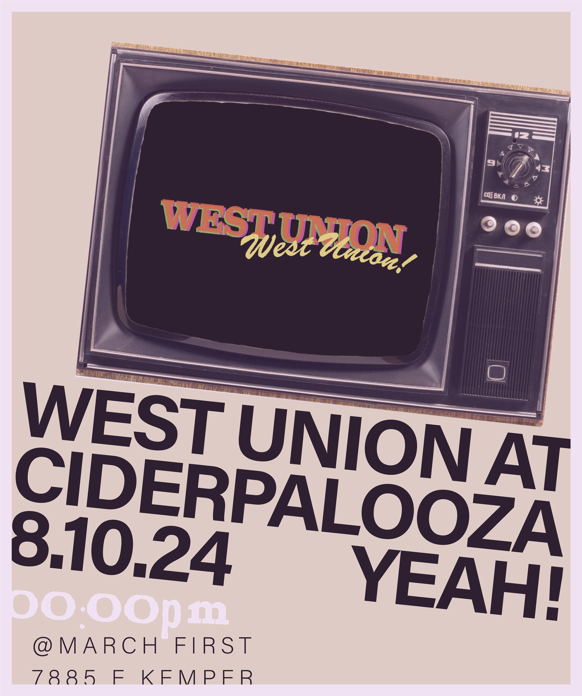


:REFINED ITERATIONS


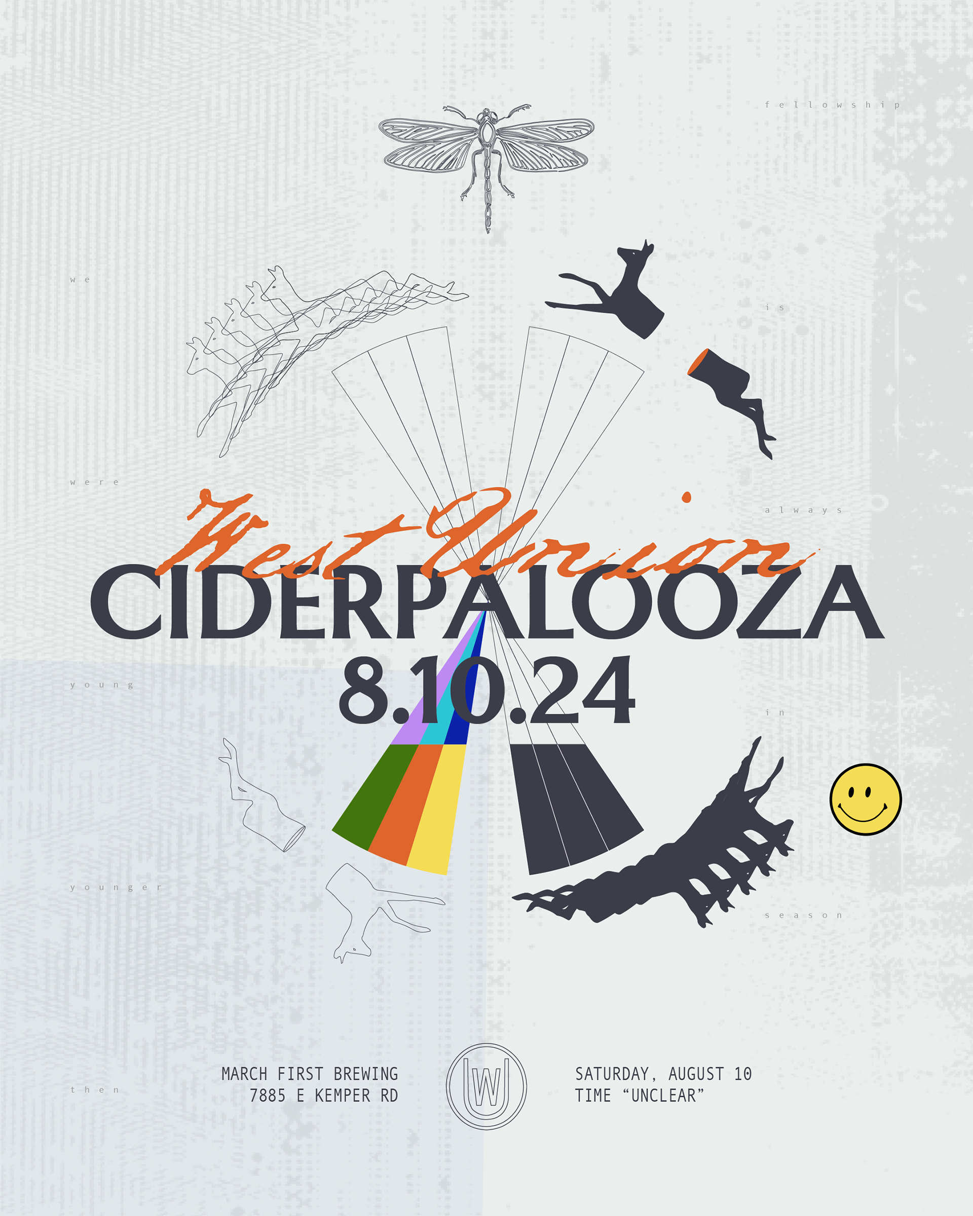
The design evolution improves hierarchy and legibility. Initially, 'West Union' is too bold, overshadowing 'Ciderpalooza,' which should be the focal point.
The image of the chair in the forest introduces unnecessary mystery, and the busyness compromises readability. The black background feels too harsh, flattening the design and losing the youthfulness of the band’s identity. As the design transforms, the background softens, adding depth and improving legibility, resulting in a more balanced and engaging visual identity.
:FINAL

